
Summary
Learn how to effectively share and showcase nonprofit data through digital reporting, including impact reports, annual reports, and more. This blog explains the importance of including both qualitative and quantitative data and how to showcase it through data visualization techniques such as infographics, charts, graphs, videos, and photos. Don't miss out on engaging your supporters and maintaining stakeholder relationships with these valuable insights.
Sharing your data effectively
Social media and newsletters are just a few ways that nonprofits can share and showcase their data. But, these methods often lack depth and context. Without a full understanding of the data, readers might be left with more questions than answers.
Digital reports, unlike social media and newsletters, are a great way to share your data. A comprehensive report, full of interactive elements and visual storytelling techniques is an ideal strategy.
And, unlike paper reporting, digital reporting is much more effective for maintaining stakeholder relationships. Plus, digital reporting targets an emerging donor base—Gen Z and Millennials. This donor base is more likely to donate online than in person and seeks authenticity in the brands and organizations they support. Meaning, they may be more drawn to a digital report than a paper one.
Digital reports include:
- Impact reports
- Annual reports
- Board reports
- Quarterly reviews
- Event recaps
- And more
What kind of data should nonprofits include in a report?
While each report is different in purpose and audience, most should include both quantitative and qualitative data.
Qualitative Data
Qualitative data, which is more descriptive by nature, is a great way to build an emotional connection with your supporters. Unlike a string of numbers, qualitative data creates a bond between your mission and the donation.
Qualitative data includes beneficiary testimonials, interviews with key stakeholders, focus group findings, observations, and case studies.
Quantitative data
Quantitative data, on the other hand, include numbers and metrics which serve to showcase progress. This type of data is the ideal complement to qualitative data. It balances emotional information with numerical information.
Quantitative data includes donor and volunteer retention rates, fundraising revenue, program expenses, grant funding, and program KPIs.
How to showcase nonprofit data
Collecting data and understanding its importance is essential. But, it’s even more crucial to showcase your findings. While there are many ways to share data, there are a few methods that are most effective. Data visualization, in particular, is one of the best strategies.
Instead of listing out metrics, or sharing a transcript of an interview, successful nonprofits create visual elements around their data. This helps stakeholders better understand your findings and connect with your story. Data visualization includes infographics, charts, graphs, videos, and photos.
Each of these strategies for data visualization engages readers in an interactive way, much more so than a string of metrics can.
Examples of great digital reports
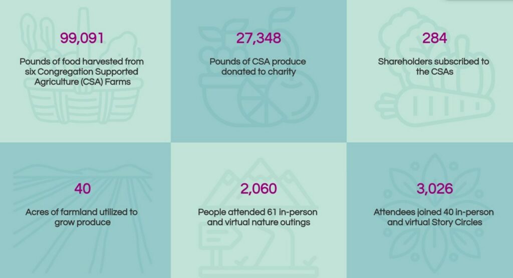
Infographics
This annual report from Faith in Place displays their quantitative and qualitative data in visually appealing ways. Their thoughtful infographics, as shown below, help readers understand their data easily.
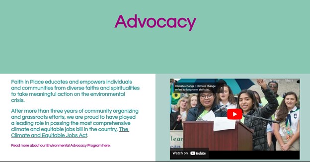
Video
To help communicate some of their qualitative data—like their advocacy efforts—Faith in Place utilizes video to contextualize their work. Emotion-driven and informative, the inclusion of videos is a powerful marketing technique.
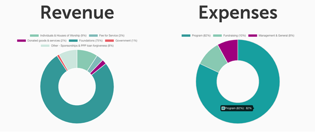
Charts
Like most annual and impact reports, Faith in Place includes their financial information. By creating an easy-to-read chart, stakeholders feel confident in their transparency.
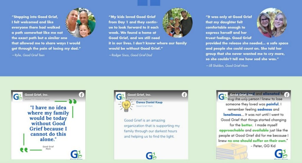
Beneficiary testimonials
Likewise, this annual report by Good Grief does an amazing job of showcasing qualitative data. Mainly, highlight beneficiary testimonials with accompanying social media posts and photos.
Ready to dive in to your data?
For nonprofits, data is essential. When it comes to sharing it, using interactive, visual elements is key.
Digital reports, no matter who the audience is, allow stakeholders to feel engaged and connected to your story—no matter your mission and goals.
Interested in creating your first digital report? Check out Yearly’s free trial!
Want to learn more?
Register for our upcoming Town Hall on Annual Reports with Actual Impact.
MNA members receive 10% off their first annual subscription with Yearly. Learn more